HomeSelect Case StudiesPartnershipsAboutStart a conversation

Vera Creative Partners, Brand Agency

Make your
vision visible.

Brand strategy and design for founders building with purpose. We bring clarity to your vision and turn it into thoughtful brand identities, editorial systems, and websites—shaped with care in every detail, built to resonate with the people you want to reach.

Book an intro call
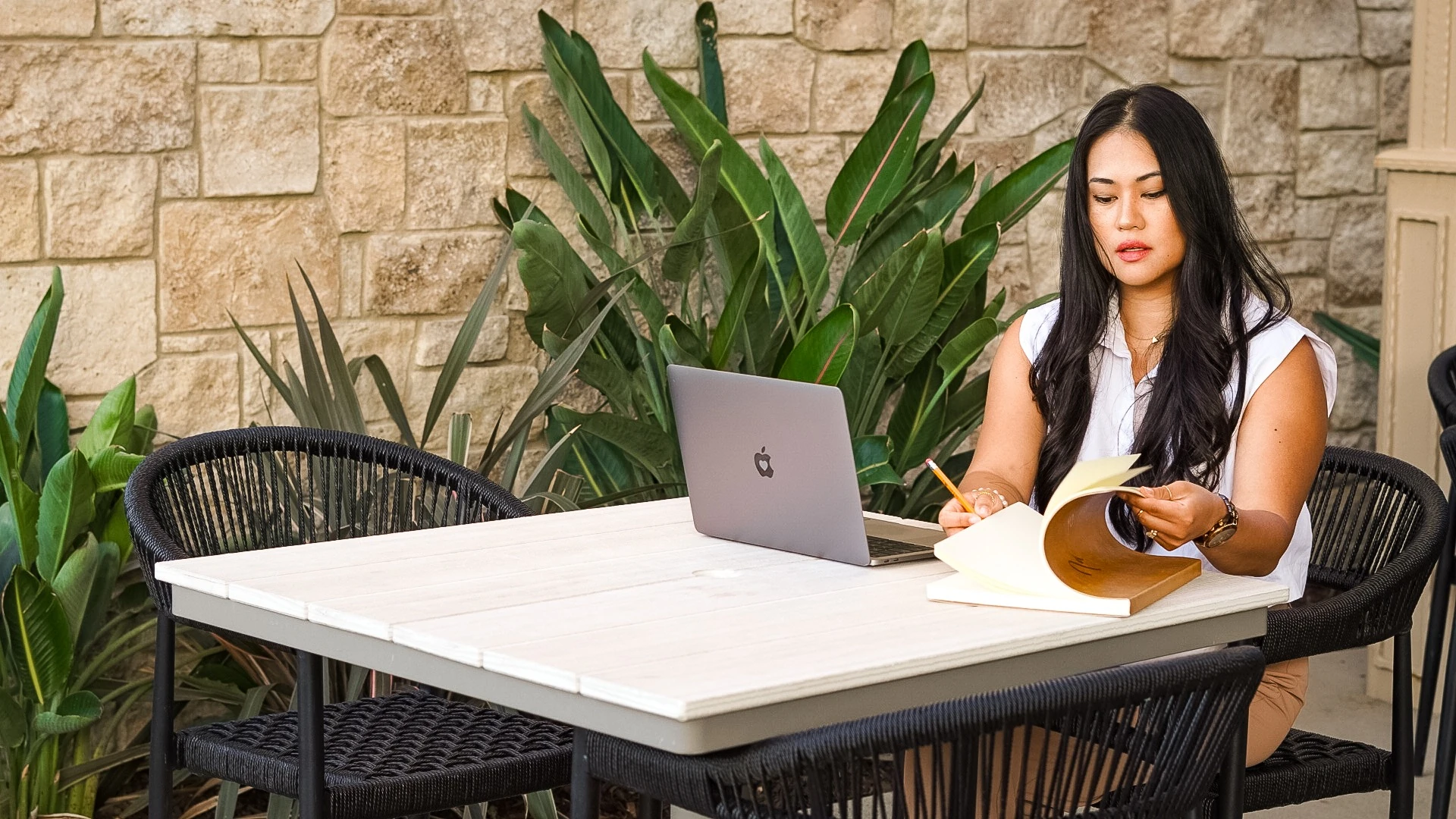
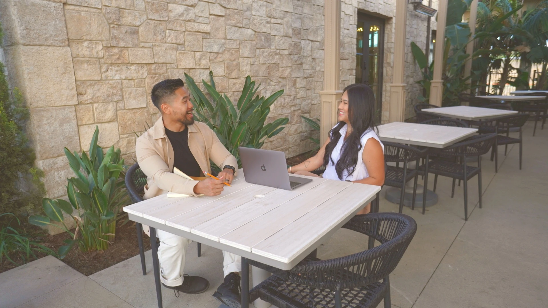
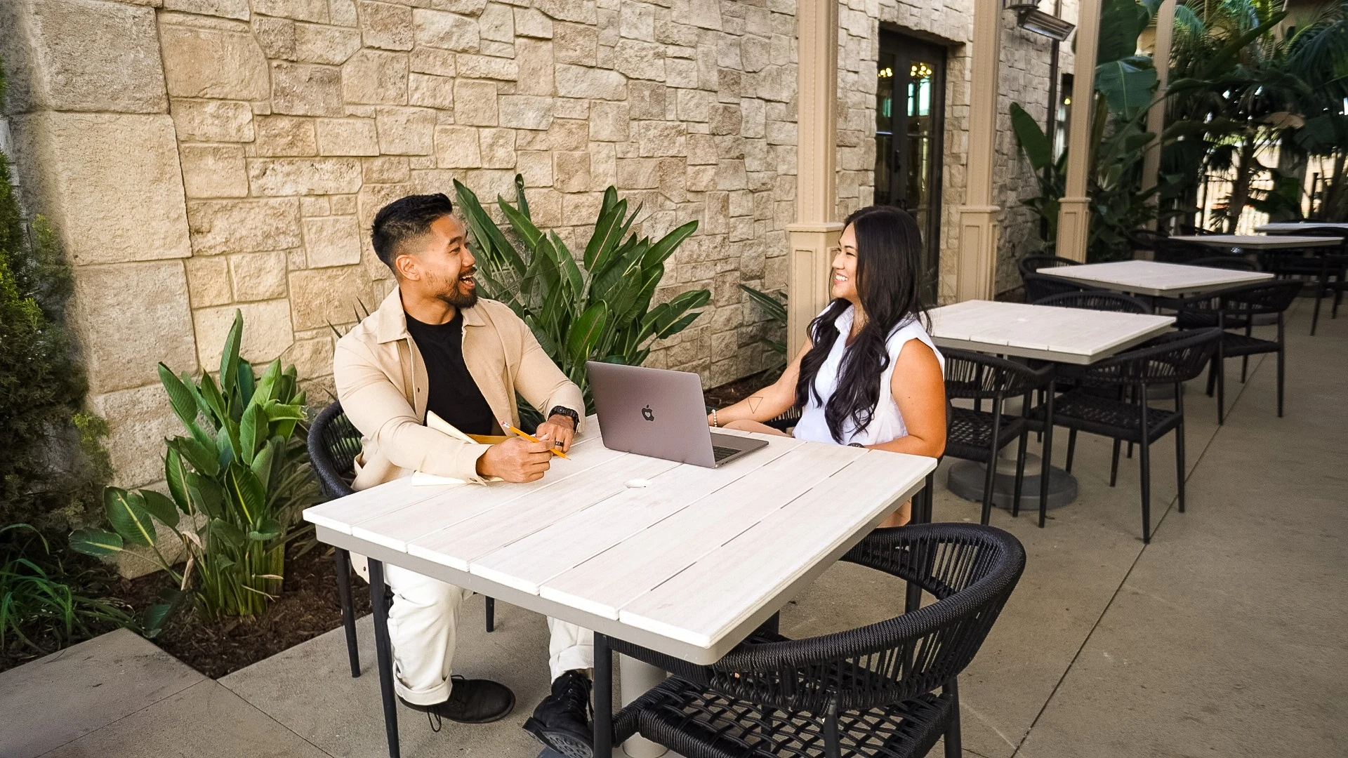
Leia and Jay working together at an outdoor café table
Vision Made Visible. ✦ Thoughtful Design for Bold Ideas. ✦ Vision Made Visible. ✦ Thoughtful Design for Bold Ideas. ✦

Ways to partner

Give your vision
room to grow.

Three ways to bring clarity, identity, and digital presence to the work ahead. We’ll help you find the right starting point.

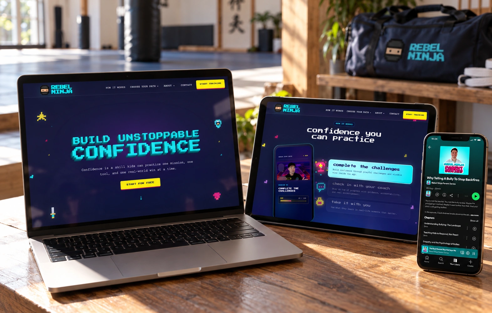
Rebel Ninja brand ecosystem showing the website, mobile experience, logo system, TV, Parent Series podcast, and Uncut identities in a training studio setting

Brand + Website

In Full View

A presence worthy of your vision.

Let people see the full promise of what you’re building. A brand and website shaped together make every first impression feel connected, considered, and unmistakably yours.

Explore In Full View
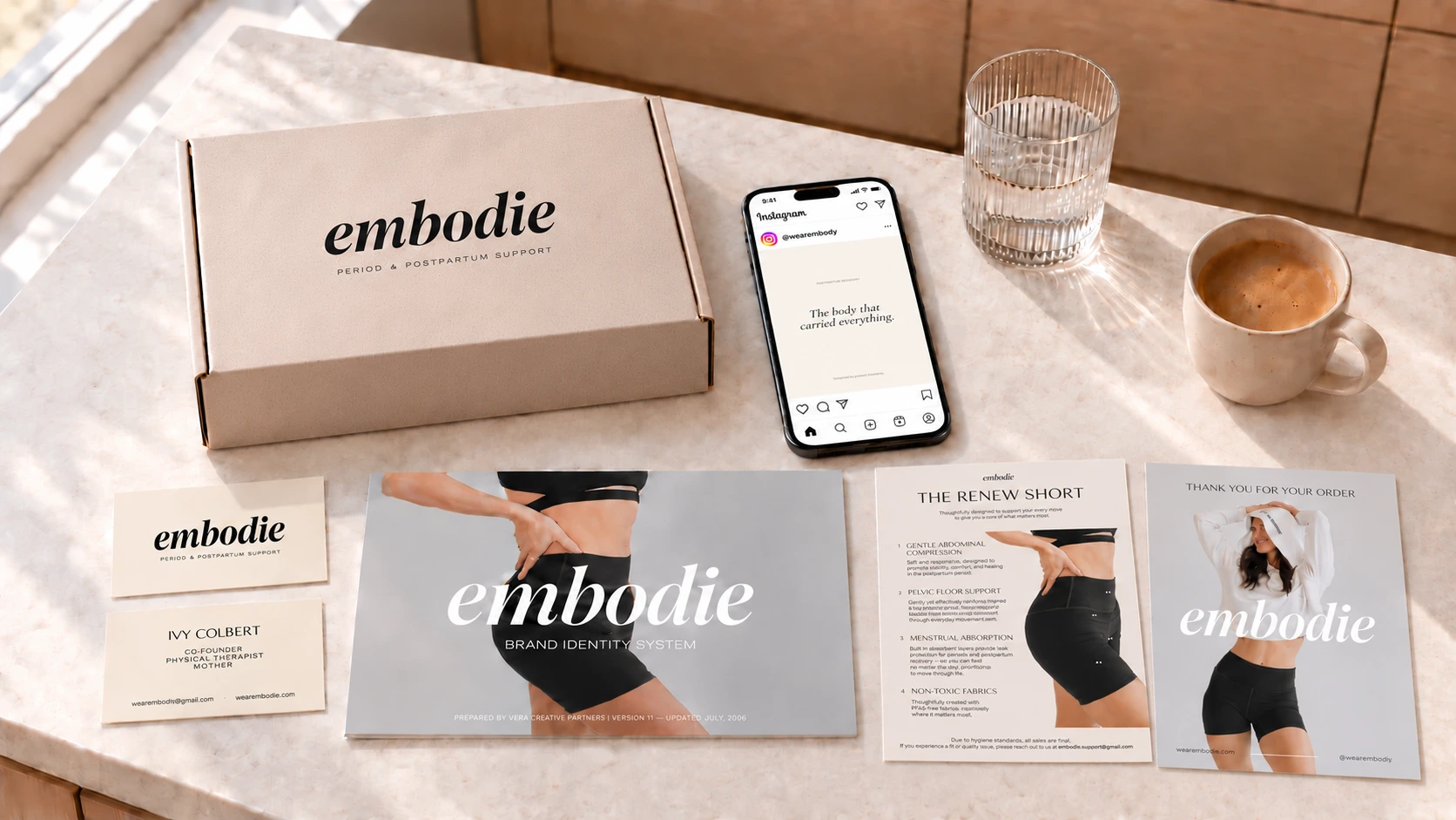
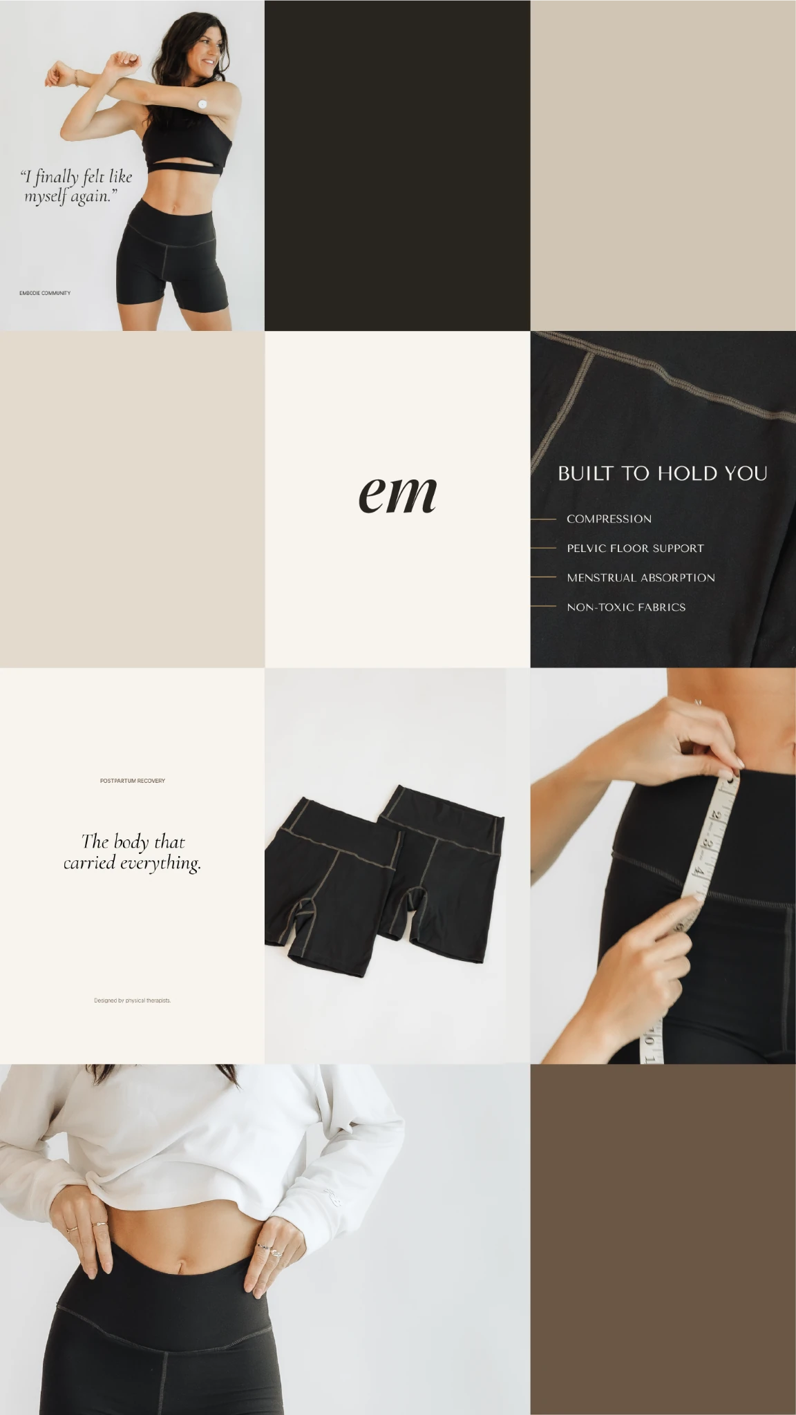
Embodie brand composite with supportwear lifestyle photography, textured cream packaging, social post phone mockup, and the italic wordmark

Brand Identity

In Form

Be recognized for what makes you different.

Give people a clear sense of who you are and why your work matters. A distinctive identity and voice help the right clients recognize themselves in your brand—and help you show up with confidence.

Explore In Form
Leia reviewing creative work

Brand Audit

In Focus

Know your next move.

See what’s working, what’s holding you back, and where your attention will make the greatest difference. Move forward with a clear direction instead of another round of guesswork.

Explore In Focus

The Vera Ethos

Meaningful work
deserves to be seen.

Protect what matters, find the clarity, and give it form.

What Becomes Possible

Branding that delivers

01

Attracts the right clients

A clear brand helps the right people recognize themselves in your work. When your message and values are clear, the people who resonate with them naturally feel drawn to you.

02

Justifies premium pricing

Strong branding elevates how your work is perceived. When people feel confident in the quality and purpose behind a brand, they’re more comfortable investing at a higher level.

03

Builds trust quickly

People form first impressions in seconds. A thoughtful, cohesive brand communicates professionalism and credibility right away, helping potential clients feel confident choosing you.

04

Creates long-term growth

A brand isn’t a one-time asset — it grows in value over time. Every interaction with your website, content, or work reinforces recognition and trust, creating momentum for sustainable growth.

Selected Work

Your vision
kept intact.

We translate the vision you started with into a brand that stays true and holds its own, from strategy and story to every place it shows up.

Leia and Jay collaborating at an outdoor table

Your Creative Partners

Present and precise.

Our partners remain directly embedded in the work from day one. We shape the strategy, direct the creative, and protect your vision straight through to launch.

We keep our client roster intentionally select so every brand we touch receives our full focus and thoughtful care.

Meet the founders

In Their Words / Client Perspectives

“Leia’s body of work is second to none.”
Founder / Schola Coffee
“Leia’s work is always incredibly thoughtful and creative.”
Brand Manager / Princess Cruises
“This is exactly the type of work that this brand needs to propel us forward.”
Creative Director / Princess Cruises
“Leia is an intuitive designer that understands the client’s needs.”
Founder / Mezcla Designs

Delivered monthly

Our newsletter,
In Good Company.

From the desks of the directors at Vera.
The work, the people behind it, and what's inspiring us lately.

From

Vera Creative Partners
    We respect your privacy. Unsubscribe at any time.

    Start a conversation

    Ready to give
    your vision form?

    Bring the idea, the challenge, or the early framework. Let us start with a direct conversation.

    Book an intro call

    Select Case Studies

    Form Given to
    Clear Thought.

    Brand identities, digital systems, and editorial platforms built for lasting market presence.

    Start your project
    Vera creative work

    Client / Embodie

    Embodie

    “Can you help us establish a new standard for postpartum supportwear with an elevated, aspirational brand that redefines the category?”

    Client
    Embodie
    Sector
    Clinical Apparel
    Scope
    Full Brand Identity · Packaging
    Read case study
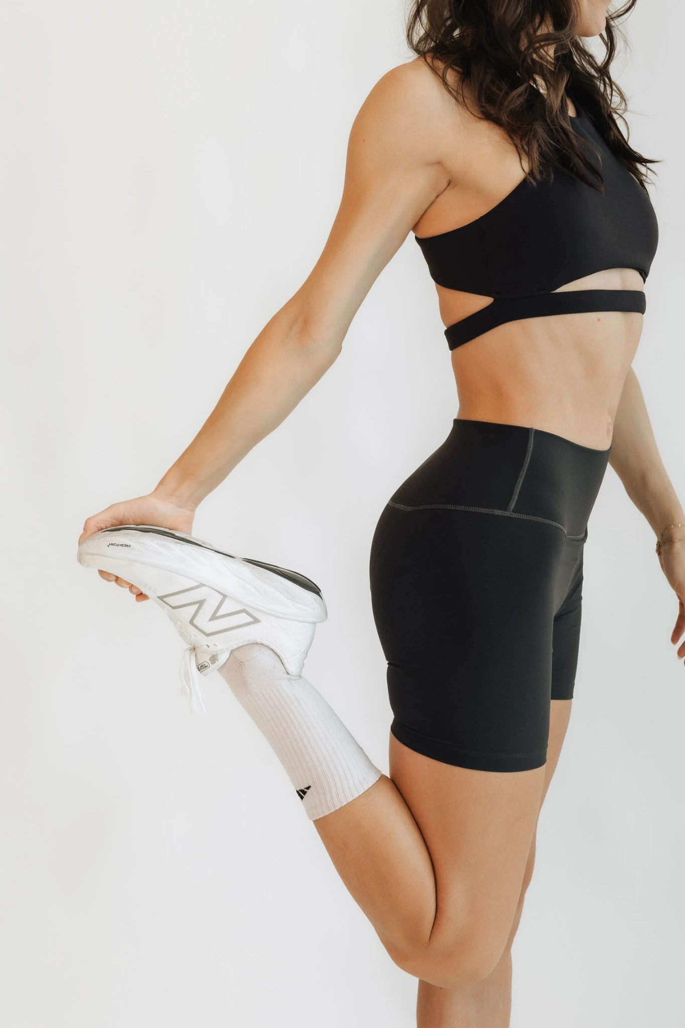
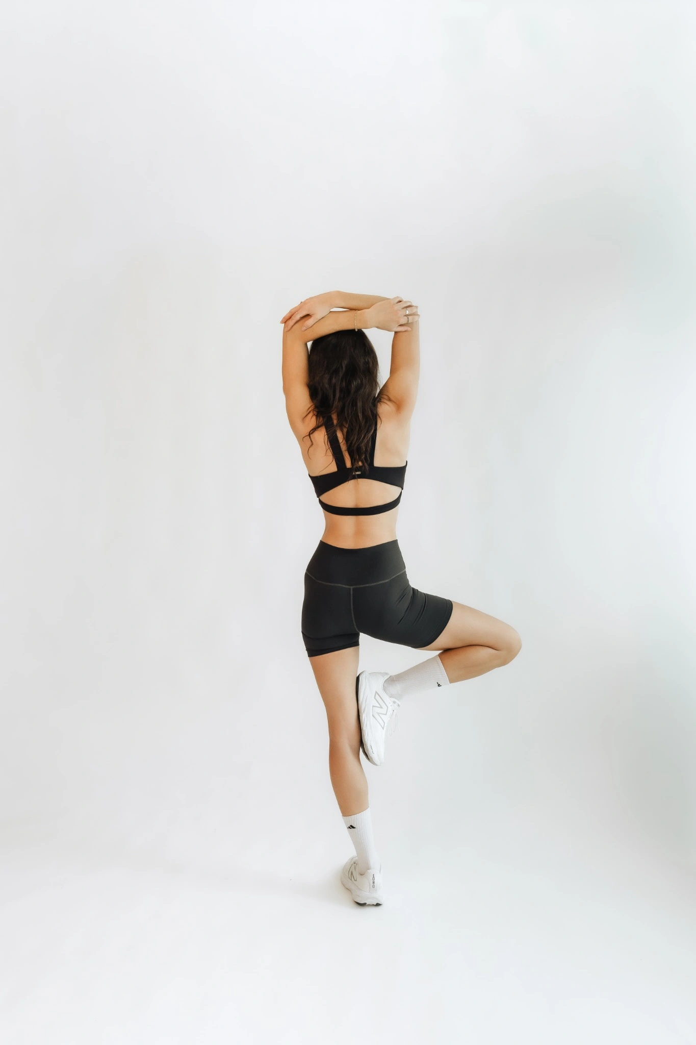
    Embodie supportwear lifestyle photography

    Client / Rebel Ninja

    Rebel Ninja

    “I’ve spent years helping kids build confidence through Kung Fu and play. Can you help me turn that into one Rebel Ninja world, with something for kids, teens, and parents?”

    Client
    Rebel Ninja
    Sector
    Youth Confidence & Coaching
    Scope
    Brand Strategy · Brand Architecture · Identity · Digital
    Read case study
    Rebel Ninja pixel artwork on a deep navy background

    Client / Frontline Partners

    Frontline Partners

    “We want the people who stand with the persecuted church to feel like family. Can you help us give that feeling an identity and a journal they’ll want to keep?”

    Client
    Frontline Partners
    Sector
    Global Mission & Humanitarian Relief
    Scope
    Brand Identity · Publication System · Editorial Strategy
    Read case study
    Aerial view of coastal waterways and islands

    In Their Words

    Thoughtful work.
    Lasting relationships.

    “Leia’s body of work is second to none.”
    Founder / Schola Coffee
    “Leia’s work is always incredibly thoughtful and creative.”
    Brand Manager / Princess Cruises
    “This is exactly the type of work that this brand needs to propel us forward.”
    Creative Director / Princess Cruises
    “Leia is an intuitive designer that understands the client’s needs.”
    Founder / Mezcla Designs

    Start a conversation

    Seen enough to imagine yours?
    Let’s give the idea somewhere to go.

    Bring the idea, the challenge, or the early framework. Let us start with a direct conversation.

    Book an intro call

    About Vera

    Direct Access.
    Close Collaboration.

    Our partners lead every project from first strategy to launch, so your vision stays intact from start to finish.

    Explore partnerships
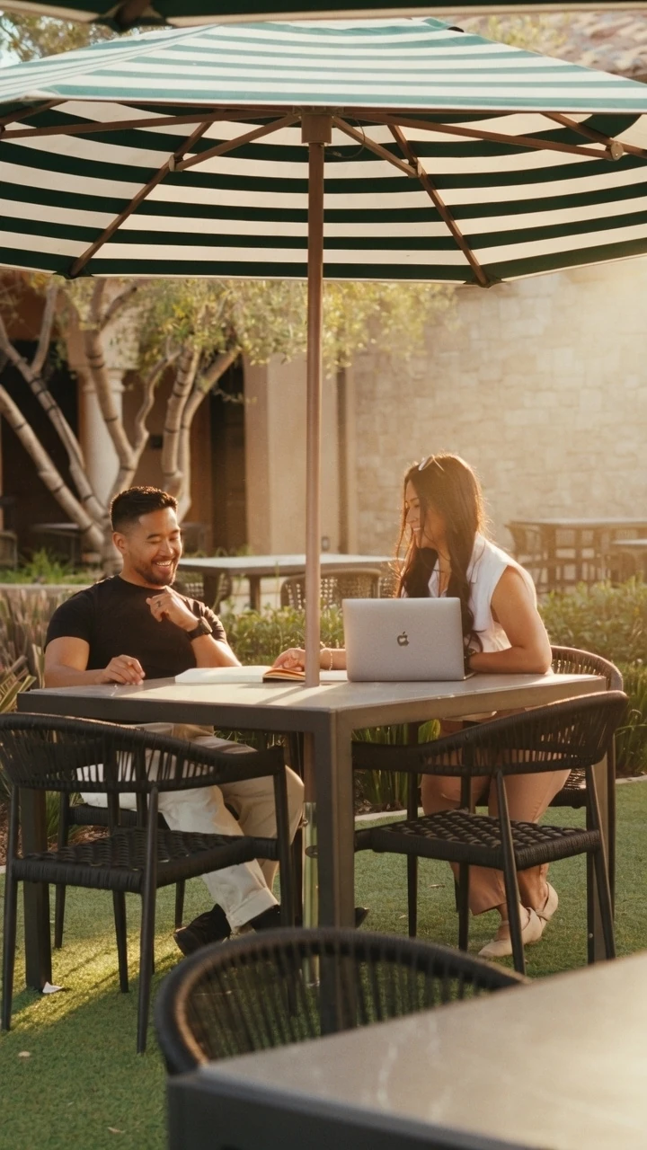
    Leia and Jay working together at a sunlit outdoor table

    From Our Founders

    We started Vera
    to protect the first spark.

    Leia and Jay in conversation at an outdoor table
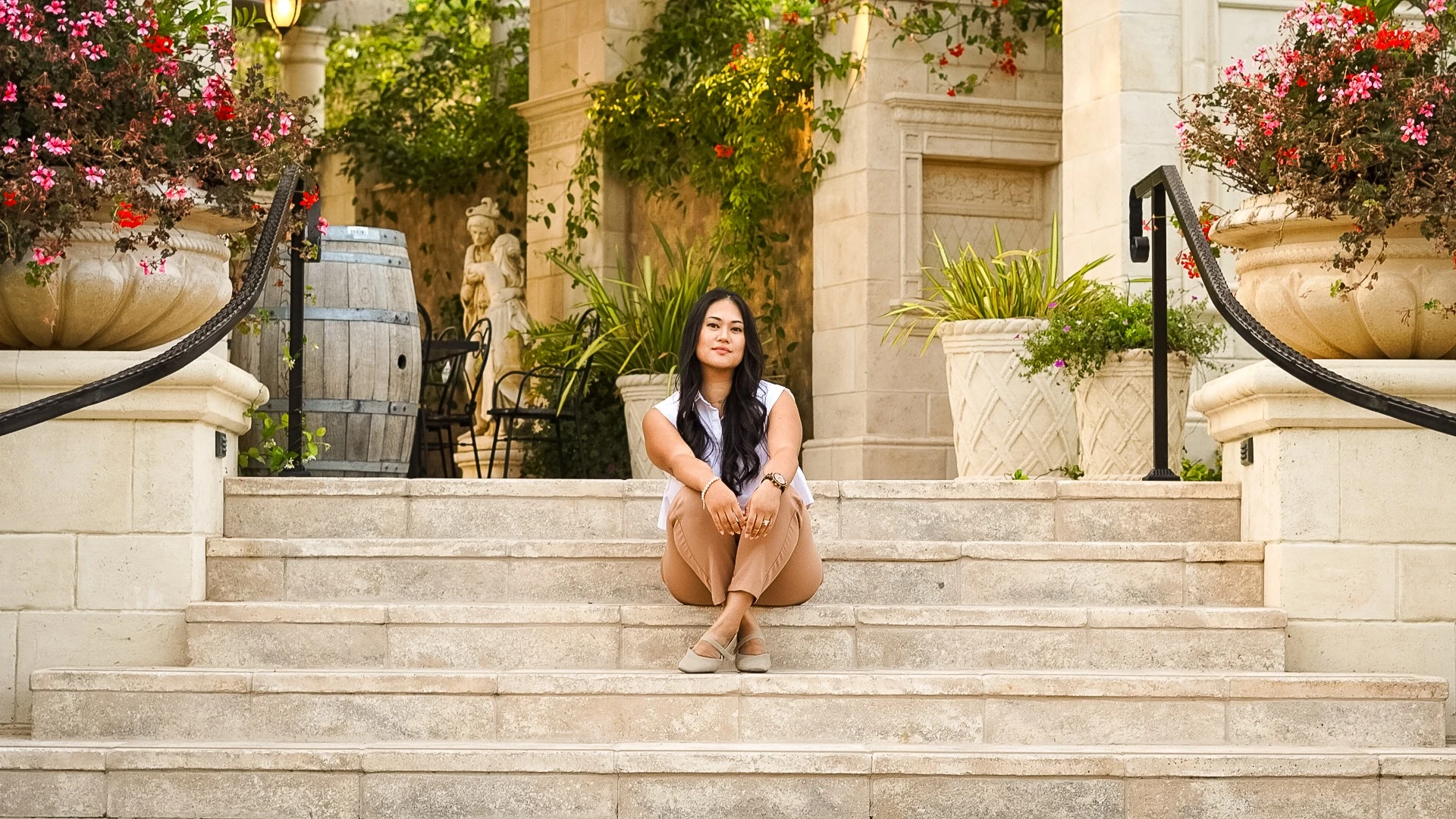
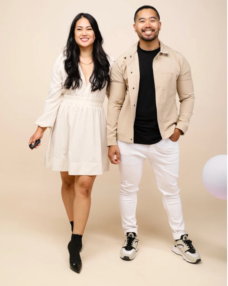
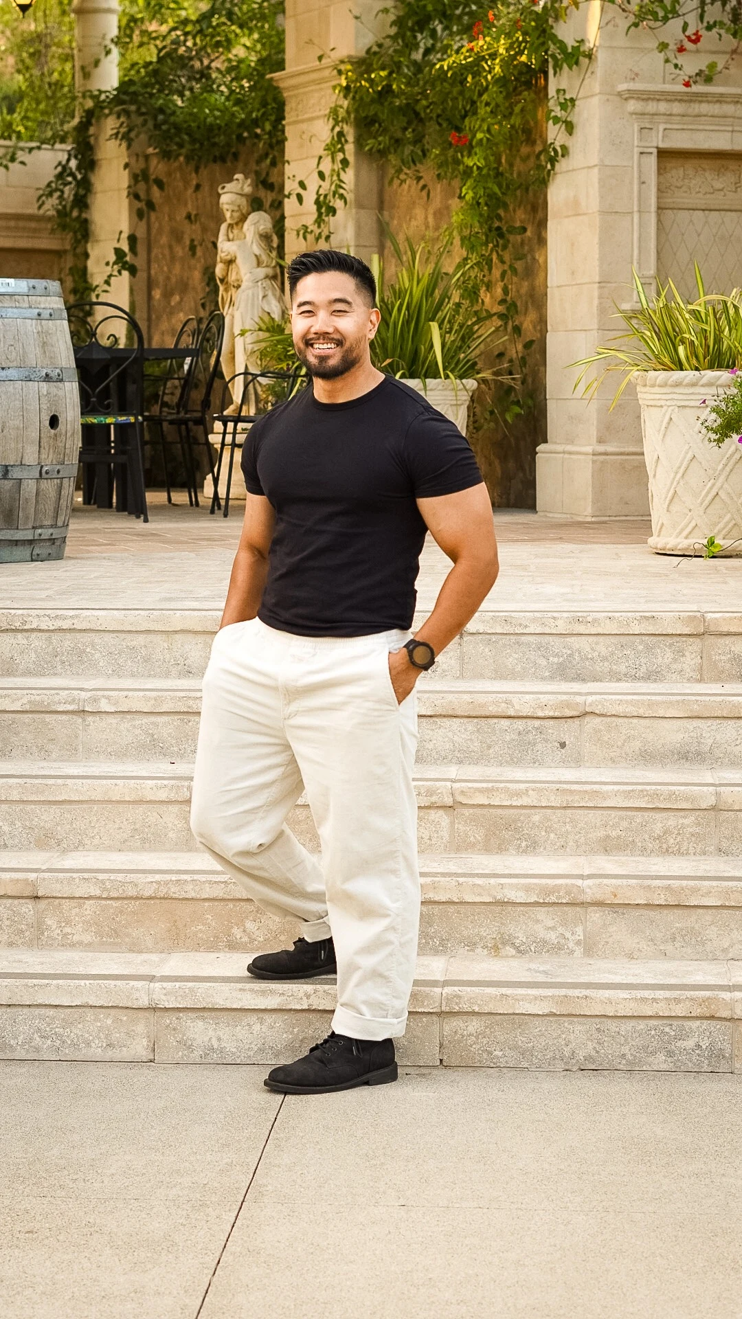
    Leia and Jay standing together
    Leia and Jay working together at an outdoor table

    A note from Leia + Jay.

    To the ones building what doesn't quite exist yet,

    We know the strange middle because we've spent our careers in it. Between us, we've spent more than two decades building brands for global names and first-time founders. We've seen what happens when a clear vision passes through too many opinions, or gets dressed in a trend that was never its own. By the time it reaches the world, the part that mattered most can feel lost.

    We started Vera to protect it. We stay close enough to hear what you mean before you've found the words, and we keep listening as the idea takes shape. Sometimes the best part of the work surfaces in a passing message, a new question, or a turn none of us saw coming.

    Be as involved as you'd like, or step back and let it take shape. We can't wait to see what you're building.

    With you,Leia + Jay

    Years experience
    20
    Industries served
    14
    Years partnership
    13

    Leadership

    Directors Behind
    the Vision.

    Leia Mariano / Creative Director

    Creative Director

    Leia Mariano

    With over two decades steering art direction across hospitality, entertainment, consumer brands, and wellness, Leia views design as a discipline of restraint and conviction. She leads the visual and verbal direction at Vera, turning abstract strategic ideas into memorable brand worlds.

    Explore Leia’s portfolio

    The Vera Ethos

    Meaningful work
    deserves to be seen.

    Our prescription for the work: protect what matters, find the clarity, and give it form.

    01

    Protect the original intent.

    Keep the conviction that started it all at the center. Let it guide what you say, what you make, and how you grow.

    02

    See before you show.

    Get clear on what you mean before deciding how it should look. A visual identity is stronger when it has something true to express.

    03

    Choose meaning over noise.

    Give people something to recognize and return to. Build from your own point of view instead of the latest trend.

    04

    Build a system you can use.

    Create a foundation your team can carry into every touchpoint. Make consistency easier as the work grows.

    05

    Make the invisible tangible.

    Give the vision in your head a form others can understand, trust, and step into.

    Founded by creatives trusted by teams at

    Amazon    Capital One    Discovery    Disney Interactive    Hulu    Forever 21    Joybird    Netflix    Pepsi    Princess Cruises    Rockefeller Center    WarnerMedia    

    In Their Words

    Thoughtful work.
    Lasting relationships.

    “Leia’s body of work is second to none.”
    Founder / Schola Coffee
    “Leia’s work is always incredibly thoughtful and creative.”
    Brand Manager / Princess Cruises
    “This is exactly the type of work that this brand needs to propel us forward.”
    Creative Director / Princess Cruises
    “Leia is an intuitive designer that understands the client’s needs.”
    Founder / Mezcla Designs
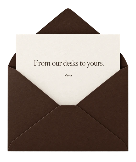
    A cream personal letter peeking out of a chocolate envelope, reading From our desks to yours

    Delivered monthly

    In Good Company.

    From the desks of the directors at Vera.
    The work, the people behind it, and what's inspiring us lately.

    Get the letter

    Start a conversation

    You can see the change it could make.
    We help the world see it too.

    Bring the idea, the challenge, or the early framework. Let us start with a direct conversation.

    Book an intro call

    Ways to Partner

    Find the right shape for your next chapter.

    Three ways to bring clarity, identity, and digital presence to the work ahead. We’ll help you find the right starting point.

    Let’s find your starting point
    Vera creative partnership

    A connected foundation

    Brand, voice, identity,
    and website.

    A clear foundation your team can build on, and one strategic partner instead of multiple vendors.

    Brand + Website

    In Full View

    A presence worthy of your vision.

    Let people see the full promise of what you’re building. A brand and website shaped together make every first impression feel connected, considered, and unmistakably yours.

    6–8 weeks

    Discuss this engagement
    Rebel Ninja brand ecosystem with digital, print, and lifestyle applications

    The Scope

    Strategy

    • Brand Foundation: purpose, positioning, audience + brand language
    • Market + competitive research
    • Strategic advantage + roadmap

    Identity + voice

    • Logo suite, color, typography + photography direction
    • Voice, tone, taglines + elevator pitch
    • Official brand guide + 3 brand applications

    Website

    • Custom multi-page website, designed + built
    • Page-by-page copywriting direction + SEO foundation
    • Mobile optimization, testing + domain connection
    You leave with

    Brand, voice, identity, and website, ready to launch as one connected system.

    Brand Identity

    In Form

    Be recognized for what makes you different.

    Give people a clear sense of who you are and why your work matters. A distinctive identity and voice help the right clients recognize themselves in your brand—and help you show up with confidence.

    4–6 weeks

    Discuss this engagement
    Embodie packaging, printed inserts, brand guide, and social mockup

    The Scope

    Strategy

    • Brand Foundation: purpose, positioning, audience + brand language
    • Market + competitive research
    • Strategic advantage + roadmap

    Identity + voice

    • Logo suite, color, typography + photography direction
    • Voice, tone, taglines + elevator pitch
    • Official brand guide

    Applications

    • 3 brand applications
    • Digital, print + experiential touchpoints as needed
    • Ready-to-use final asset files
    You leave with

    A complete brand foundation, clear, recognizable, and ready to use.

    Brand Audit

    In Focus

    Know your next move.

    See what’s working, what’s holding you back, and where your attention will make the greatest difference. Move forward with a clear direction instead of another round of guesswork.

    1 week

    Discuss this engagement
    Leia reviewing creative work

    The Scope

    Review

    • Strategy + positioning
    • Visual identity + consistency
    • Messaging, digital presence + brand experience

    Findings

    • Written assessment
    • Prioritized recommendations
    • Clear roadmap + next steps

    Walkthrough

    • Live walkthrough call
    • Findings reviewed together in real time
    • 50% of your audit investment applies to In Full View or In Form if you continue
    You leave with

    Clarity on what to change, what to protect, and where to invest next.

    A partnership shaped around you

    Have something specific in mind?

    Tell us what you’re working toward. We’ll find the right way to shape it together.

    Send us a message

    What Becomes Possible

    More room for
    what comes next.

    Reach the people you want to serve. Enter the rooms you’re ready for. Launch the next idea with a brand that can grow alongside your ambition.

    01 / Recognition

    Reach the people you’re here for.

    A clear point of view helps the right people recognize themselves in what you are building.

    02 / Credibility

    Earn confidence before the conversation.

    A cohesive brand signals intention, credibility, and care before anyone ever speaks with you.

    03 / Presence

    Show up at the level of the vision.

    When the outside finally reflects the ambition inside, the way people perceive, and invest in, the work changes too.

    04 / Room to grow

    Build what comes next without losing recognition.

    A clear system gives every new offer, campaign, touchpoint, and idea one recognizable place to grow from.

    Sunlit palm leaves

    After Launch

    Keep the system clear
    as you grow.

    After launch, we work with past clients to extend their brand across new audiences, offerings, and channels without losing clarity or consistency.

    Ongoing partnerships are available to past clients.

    Ask about partnerships

    FAQ

    A few
    useful answers.

    Do I need a complete brief?

    No. Knowing what you want to change is enough to begin. We’ll help sharpen the rest.

    Can Vera work with an existing brand?

    Yes. When there is equity worth keeping, we find what should stay and what needs to catch up.

    Does messaging come with identity?

    Yes in Options 01 and 02. The words and visual world should come from the same idea.

    What happens after launch?

    Ongoing creative partnership is available to past clients when the brand needs continued stewardship.

    In Their Words

    Thoughtful work.
    Lasting relationships.

    “Leia’s body of work is second to none.”
    Founder / Schola Coffee
    “Leia’s work is always incredibly thoughtful and creative.”
    Brand Manager / Princess Cruises
    “This is exactly the type of work that this brand needs to propel us forward.”
    Creative Director / Princess Cruises
    “Leia is an intuitive designer that understands the client’s needs.”
    Founder / Mezcla Designs

    Start a conversation

    Start with what you know.
    We’ll help shape the rest.

    Bring the idea, the challenge, or the early framework. Let us start with a direct conversation.

    Book an intro call

    Start a Conversation

    Ready to Give
    Your Vision Form?

    Bring the idea, the challenge, or the early framework. Let us start with a direct conversation.

    A conversation with Vera Creative Partners

    Write to us

    Tell us what
    you have in mind.

    Share as much or as little as you have. A starting thought is enough for a conversation.

    hello@veracreativepartners.com

    Southern California · Partnering worldwide

    Prefer a conversation?

    If you’d rather talk than fill out a form, we’d love to hear what you’re working on.

    Book a call instead

    This opens your email app with your message ready to send.

    Making Postpartum Support Feel as Coveted as Fashion

    We built an identity, voice, packaging, and digital system that pair clinical credibility with the beauty of a luxury brand.

    Embodie supportwear lifestyle photograph
    Project scope

    Market Research: Postpartum + Luxury Fashion · Brand Strategy · Identity · Voice + Messaging · 62-Page Brand Guidelines · UI System · Welcome Box Packaging · Social + Canva Toolkit · Launched September 2026

    The First Conversation

    The Vision

    “Can you help us establish a new standard for postpartum supportwear with an elevated, aspirational brand that redefines the category?”

    The Approach

    Strength and softness.

    A product this new can’t borrow its look from anyone else, so we started with what Embodie refused to be.

    Postpartum women have been offered two options. Science-backed products that feel clinical and cold, or maternity brands that soften everything into pastels and center the baby rather than the woman. Credibility or beauty, rarely both.

    We set out to close that gap from both sides: a truly premium choice for postpartum care, and a science-backed option luxury fashion had never had.

    The Color System

    Charcoal
    Brown
    Beige deep
    Linen
    White
    Gold
    Deep sage
    Olive moss

    White 25% · Charcoal 25% · Brown 15% · Beige deep 15% · Linen 15%
    Gold 2% · Deep sage 1.5% · Olive moss 1.5%

    What We Delivered

    Care in every detail.

    Embodie now holds a category of its own — supportwear that feels like luxury and stands on clinical knowledge.

    We began beneath the surface, with the strategy that gives every word and image its footing. We defined the mission, vision, and positioning, shaped four strategic pillars, and mapped six distinct women the brand is built to serve — from the new mother to the athlete to the woman in perimenopause who’s never had apparel made for her stage. Then we gave the founders language they could carry into any room: a one-liner, an elevator pitch, their founder story, and a word bank that trades “bounce back” for “restore,” “fix” for “honor.”

    • Brand foundation & positioning
    • Messaging & voice framework
    • Logo, color & typography systems
    • Photography & digital direction
    • Welcome box & printed pieces
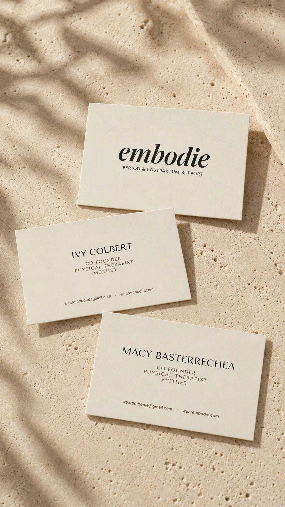
    • Business cards, social templates & email signature
    • Canva toolkit & organized asset library
    • Co-branding system with Empower PT

    From there, we gave it a voice that sounds like a hand on the shoulder from someone who truly knows. It carries the gravity of experts and the softness of someone who remembers what it feels like to be there. At its center is the cocoon — quiet, protective, working invisibly, the space where healing happens. It never lectures. It simply says: You are in the middle of change. We’ll hold you here.

    The visuals breathe the same way. A fine italic wordmark, with a small “em” emblem for the places a full logo can’t go. Warm white and linen hold the space, charcoal arrives only when something needs weight, and gold appears sparingly, like a quiet signature — every pairing tested for accessibility. Four typefaces, each with a single job. Photography direction built on window light, golden hour, and real bodies at real stages, never retouched away.

    Packaging / The Embodie welcome experience
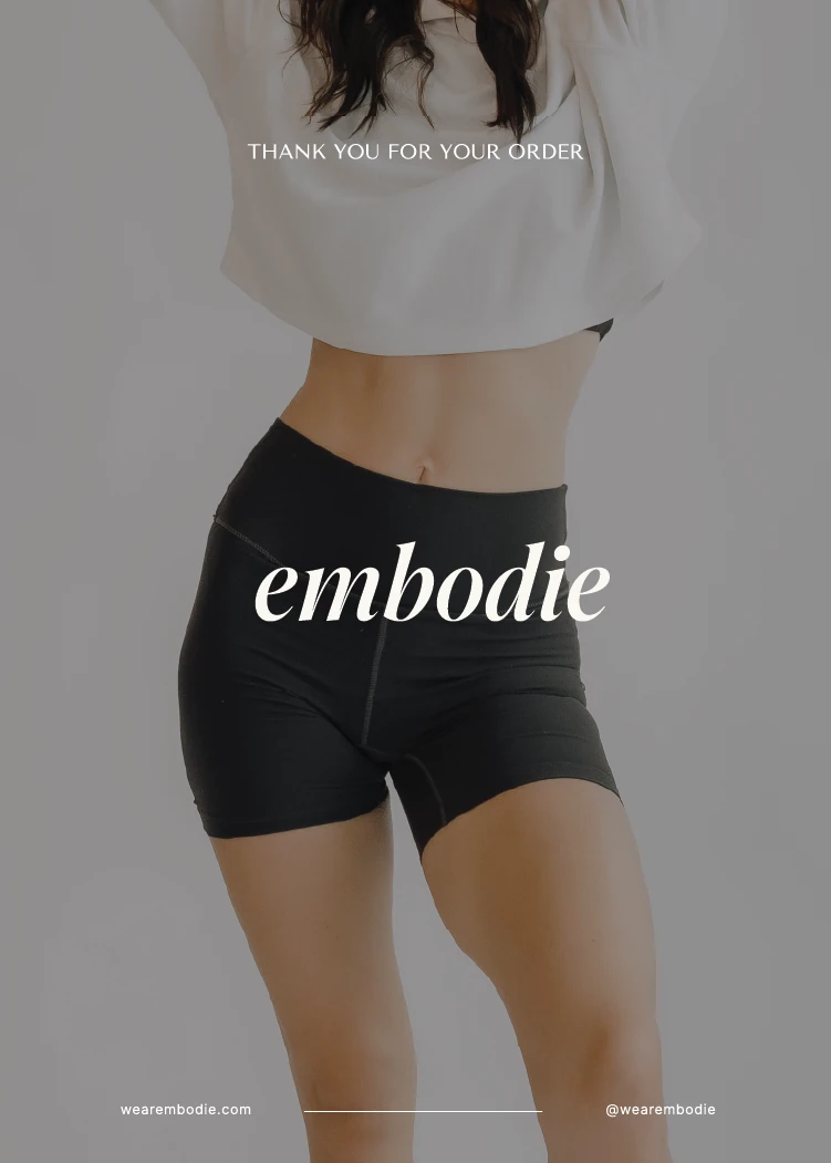
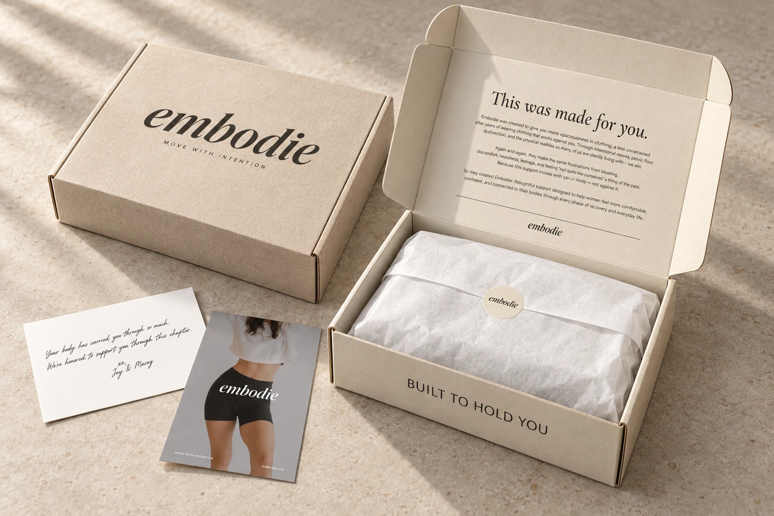
    Embodie welcome box and printed inserts
    Packaging / The welcome box
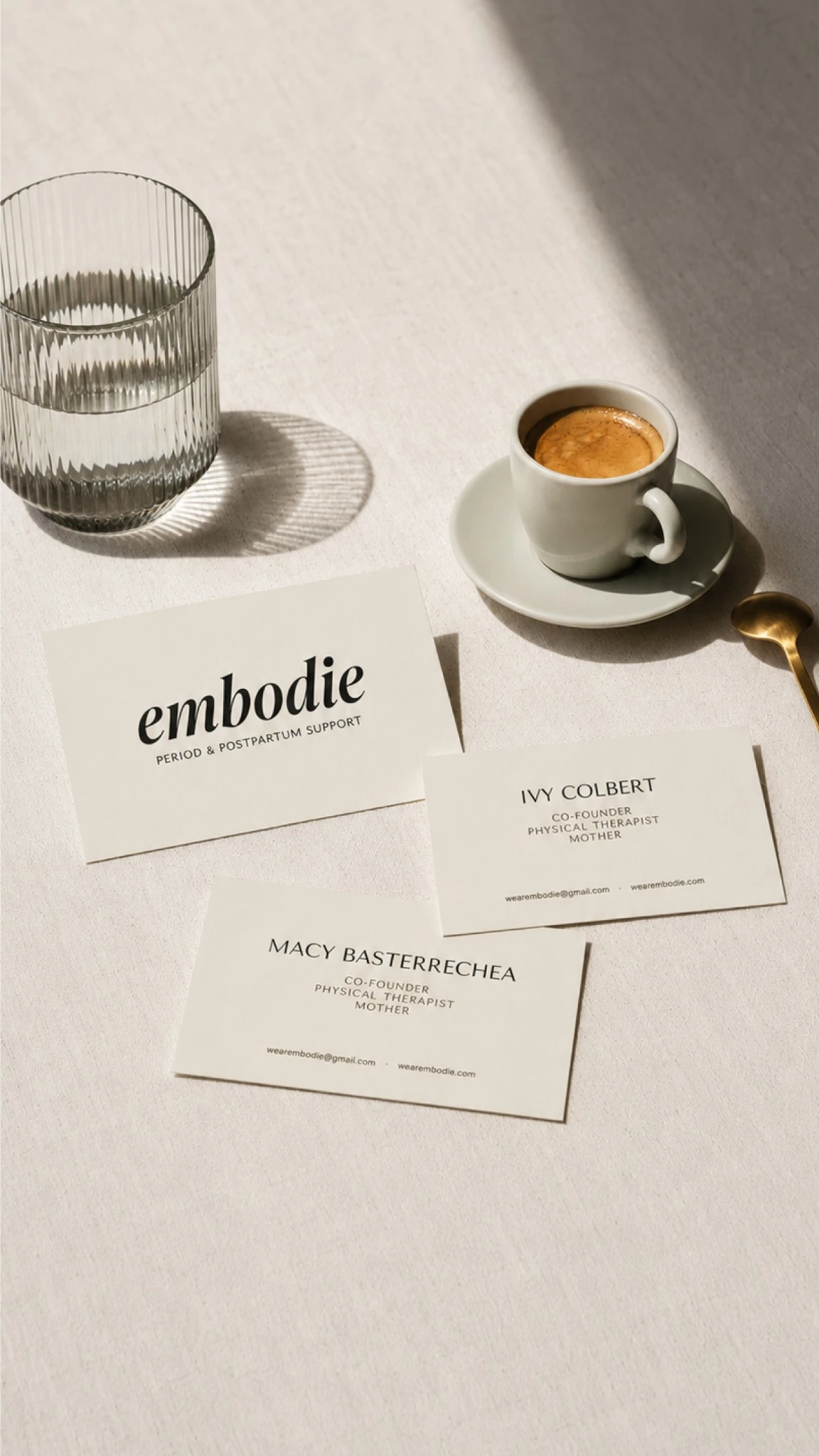
    Embodie founder business cards on sunlit travertine
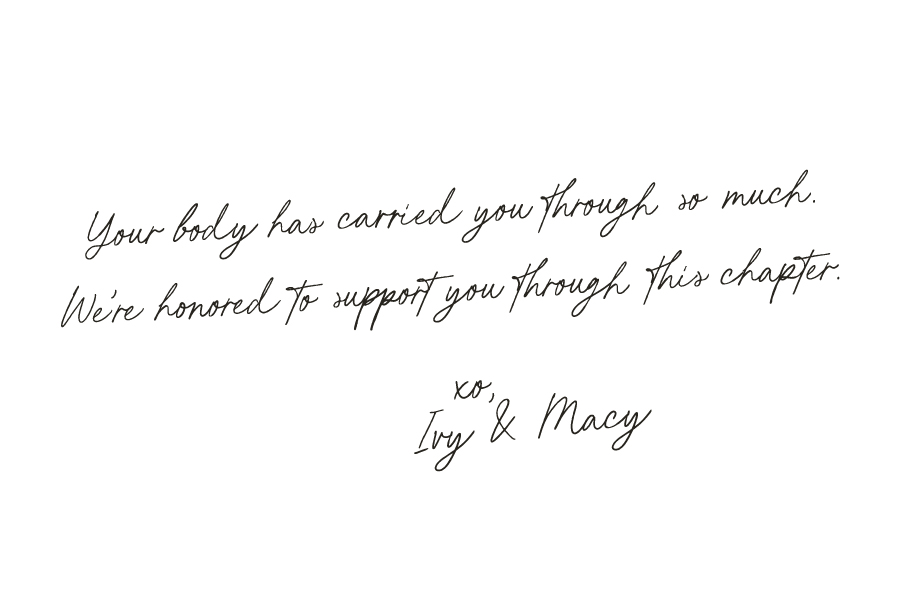
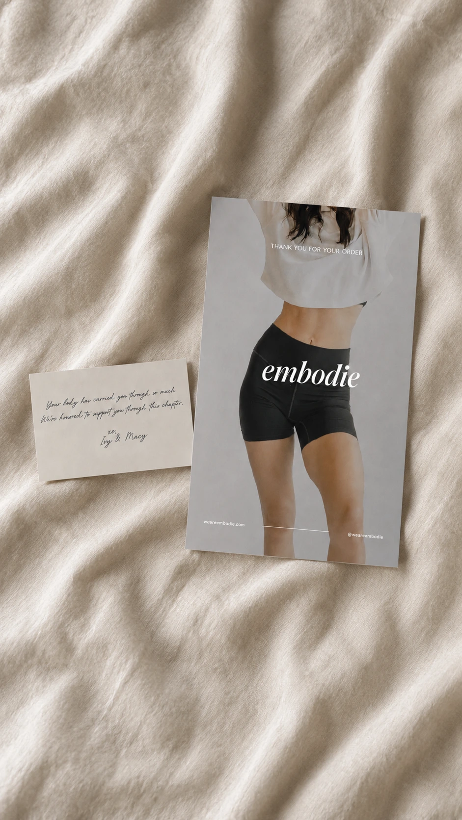
    Embodie welcome insert and handwritten founder note on linen
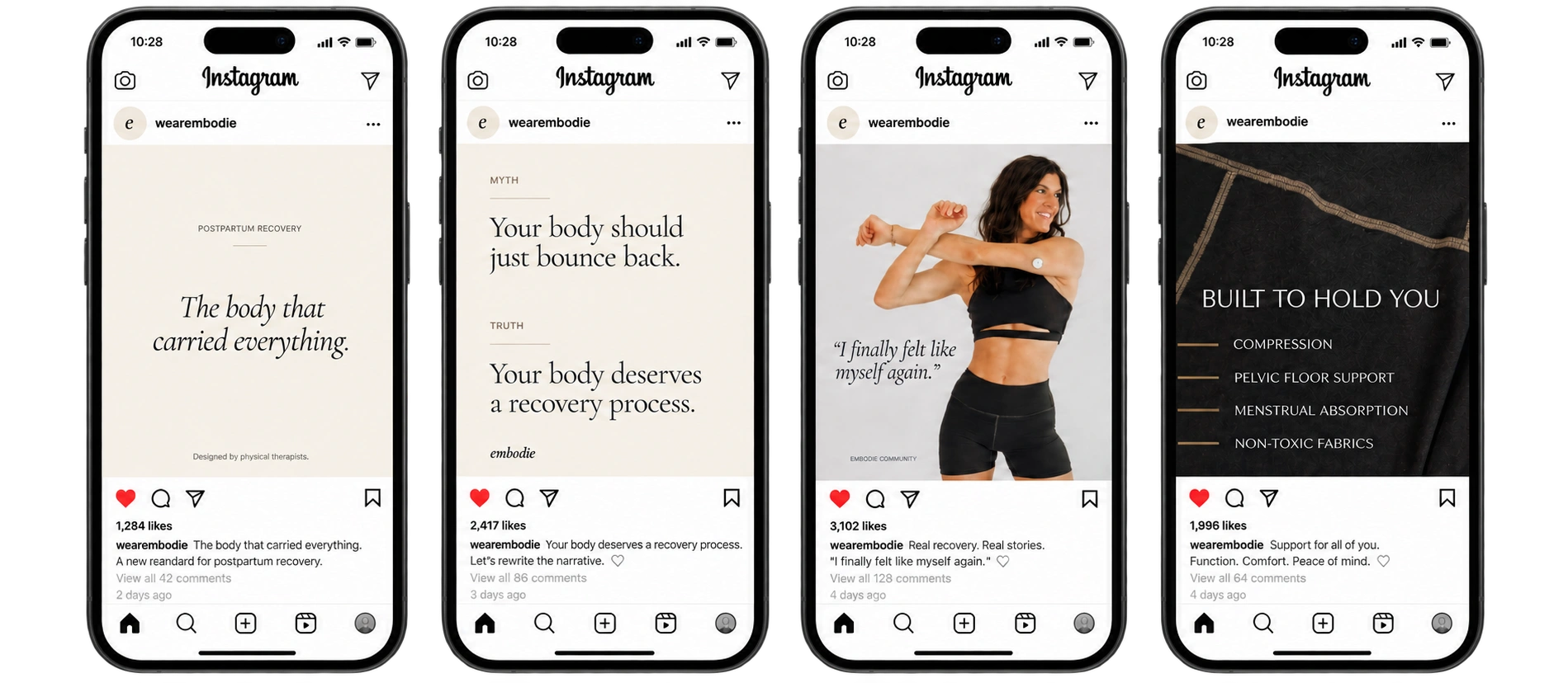
    Four Instagram phone mockups displaying Embodie’s original social artwork
    Social / The brand in everyday use

    The Outcome

    A brand with room to grow.

    Then we carried it into the world. A full interface system, down to motion that moves like a slow exhale. A welcome box that opens to Built to hold you, with a handwritten note from Ivy and Macy tucked inside. Business cards, email signatures, social templates, a co-branded lockup with their clinical partner, Empower PT, and a Canva toolkit so their team can keep building on-brand long after launch.

    In Their Words

    “Leia and Jay were amazing to work with! They helped us with everything from our branding and logo to our packaging design, social media templates, and brand guidelines. The entire process felt seamless and professional, and they truly went above and beyond for us.
    They really took the time to understand our brand, our vision, and what we wanted everything to feel like. Somehow, they took all of the ideas in our heads and brought them to life even better than we imagined! They were creative, thoughtful, easy to communicate with, and made the whole experience so enjoyable.

    We couldn’t be happier with how everything turned out. If I could give 10 stars, I would! Thank you so much, Vera—we are so grateful for you!”
    Embodie
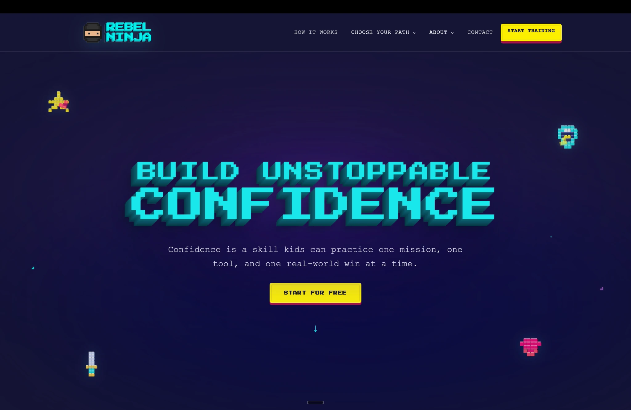
    Rebel Ninja website and digital brand system

    Next Case Study

    Rebel Ninja

    Giving Rebel Ninja a Brand Strategy That Scales

    Explore the case study

    Start a conversation

    Start with what you know.
    We’ll help shape the rest.

    Book an intro call

    Giving Rebel Ninja a Brand Strategy That Scales

    We built a fresh brand identity and split Rebel Ninja’s content into three distinct channels—giving his podcast, YouTube, and Instagram audiences each a space tailored specifically to them.

    Midnight blue background with colorful floating pixel symbols
    Project scope

    Brand Strategy · Brand Architecture · Identity + Logo Suite · Voice + Messaging · Three-Channel YouTube Branding · 53-Page Brand Guidelines · Pixel Icon System · Podcast + Social Templates · Motion + Sound Direction · Website

    The First Conversation

    The Vision

    “I’ve spent years helping kids build confidence through Kung Fu and play. Can you help me turn that into one Rebel Ninja world, with something for kids, teens, and parents?”

    The Approach

    Play with purpose.
    Rebel Ninja was never going to be another talk about being brave, so we started with what it refused to be.

    Most confidence content for young people lands in one of two places. It’s either earnest and careful, made for parents and lost on kids, or loud and entertaining with nothing underneath. Help or fun, rarely both.
    We set out to close that gap by making the fun the method: a world kids actually want to enter, where every win is a real skill.

    The Color System

    Midnight
    Dark Blue
    Rebel Teal
    Dark Teal
    Rebel Yellow
    Rebel Pink
    Med Purple

    What We Delivered

    One world. Three doors.

    Rebel Ninja now has a world of its own — one brand, three doors, each built for the person walking through it.

    We started with the architecture that lets it speak to everyone without sounding like no one. We defined the mission, the vision, and three pillars: Unstoppable, Confident, Playful. Then we built an endorsed family beneath the master brand. Rebel Ninja TV is for kids 5–12, Rebel Ninja Uncut is for teens, and the Parent Series is for the grown-ups. Each has its own tone and its own color, so you know which door you’re at before you read a word. Then we gave Andrew language he could carry anywhere: a tagline, a boilerplate, and a one-liner that does the heavy lifting — “Confidence isn’t something you’re born with — it’s something you build.”

    The voice sounds like a kid’s best coach — hyped-up, honest, always in their corner. Five traits hold it steady while the register shifts with whoever is listening. Kids get game-world energy, teens get straight talk without the cringe, and parents get warm, plain answers. It never pressures and never preaches. It simply says: Every kid is a ninja. Some just haven’t found their move yet.

    Website / A world built for kids, teens, and parents

    On Spotify

    A voice in
    your corner.

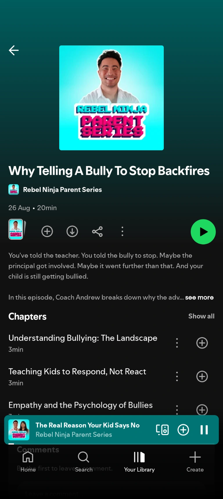
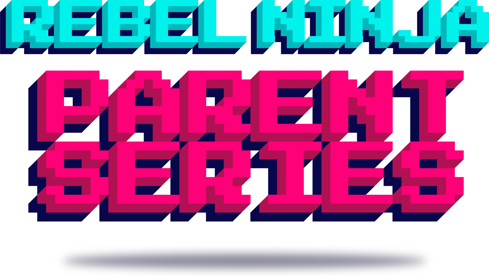
    The Rebel Ninja Parent Series brings Coach Andrew’s warm, straight-talking guidance to Spotify. We gave the podcast a distinct identity that carries the Rebel Ninja world into parents’ everyday listening.

    Rebel Ninja Parent Series · Podcast identity

    Rebel Ninja Parent Series on Spotify, featuring the episode Why Telling A Bully To Stop Backfires

    The Outcome

    Built to play.

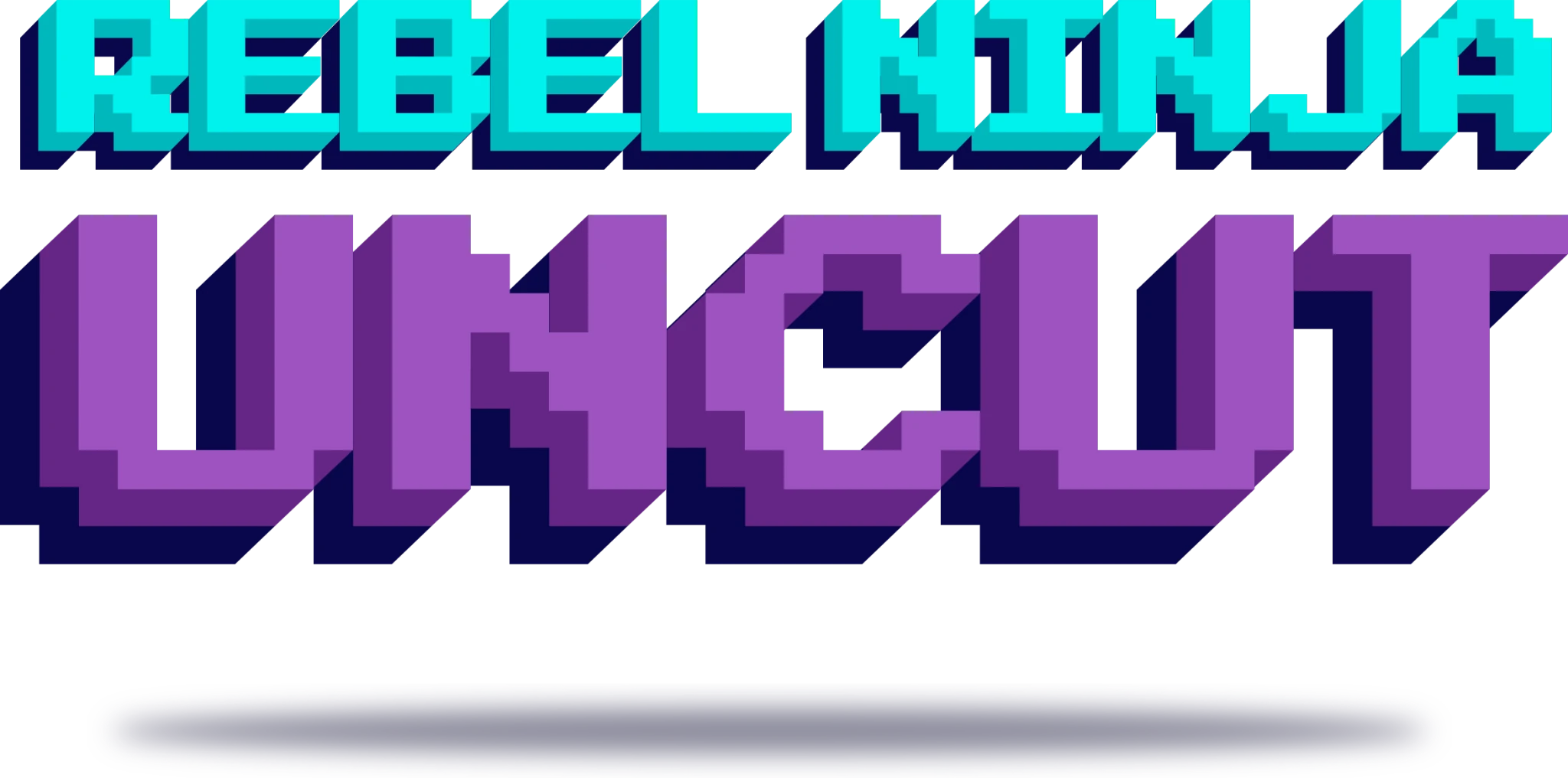
    The visuals live in an 8-bit world. A pixel ninjahead stands on its own as an icon, a voxel wordmark is built for hero moments, and flat versions in teal, midnight, and white cover everywhere else. Midnight holds the canvas, Rebel Teal leads, and Rebel Yellow and Rebel Pink arrive in small, bright bursts, with every pairing contrast-tested. Press Start 2P and Silkscreen bring the arcade. Consolas carries anything long or parent-facing, because pixel type was made to shout, not to explain. Icons are drawn on a 16×16 grid. Photography direction is built on real kids in motion: action hero, not class photo.

    Then we carried it into the world. Each of the three channels got a complete YouTube kit: profile images, banners mapped to every screen from phone to TV, and thumbnail templates. We built a master podcast template in Figma and social formats for TikTok, Reels, feed, and YouTube. Motion snaps in stepped easing and builds the logo pixel by pixel, and a short chiptune sting signs off. The website gives each audience its own path. Kids finish missions and earn EXP, and then a phone screen lights up with an incoming call: Andrew is calling.

    • Brand strategy and architecture
    • Identity and logo suite
    • Voice and messaging
    • Three-channel YouTube branding
    • 53-page brand guidelines and pixel icon system
    • Podcast and social templates
    • Motion and sound direction
    • Website

    The System in Use

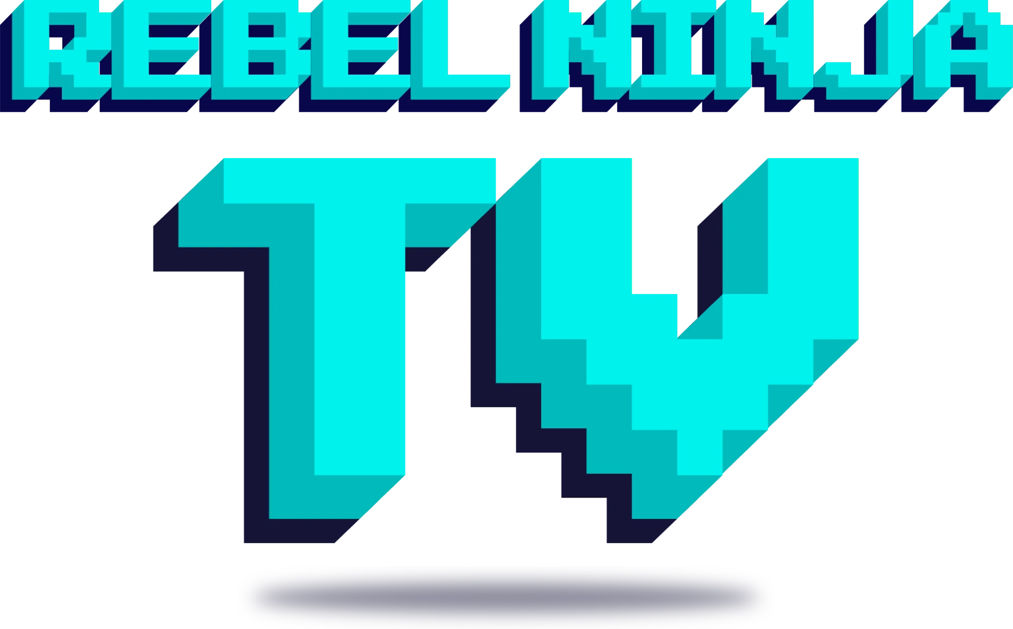
    Electric teal Rebel Ninja TV identity
    Kids 5–12

    Rebel Ninja TV

    Kids get game-world energy: missions, small wins, and skills they can practice.

    Purple Rebel Ninja Uncut identity
    Teens

    Rebel Ninja Uncut

    Teens get straight talk without the cringe.

    Pink Rebel Ninja Parent Series identity
    Parents

    Parent Series

    Parents get warm, plain answers, always in their corner.

    In Their Words

    “Their biggest problem is probably their perfectionism. They actually care about my mission and learned as much as they could what was so important to me. I've mostly been doing a lot of my creatives on my own on platforms like Canva but after I shared with them everything I was looking for, they took it to heights I didn't know was even possible. I could have never been able to imagine nor create everything they have done for the Rebel Ninja brand. I am ever so thankful and will shout from the rooftops about these guys. Thank you so much ❤️”
    Rebel Ninja
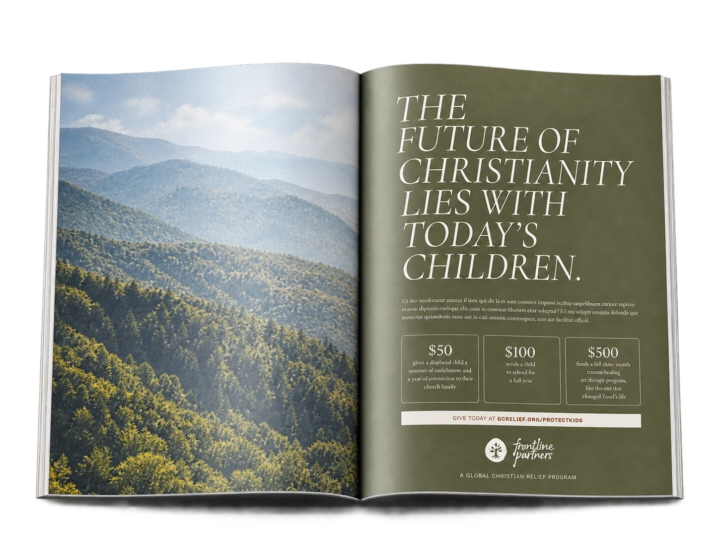
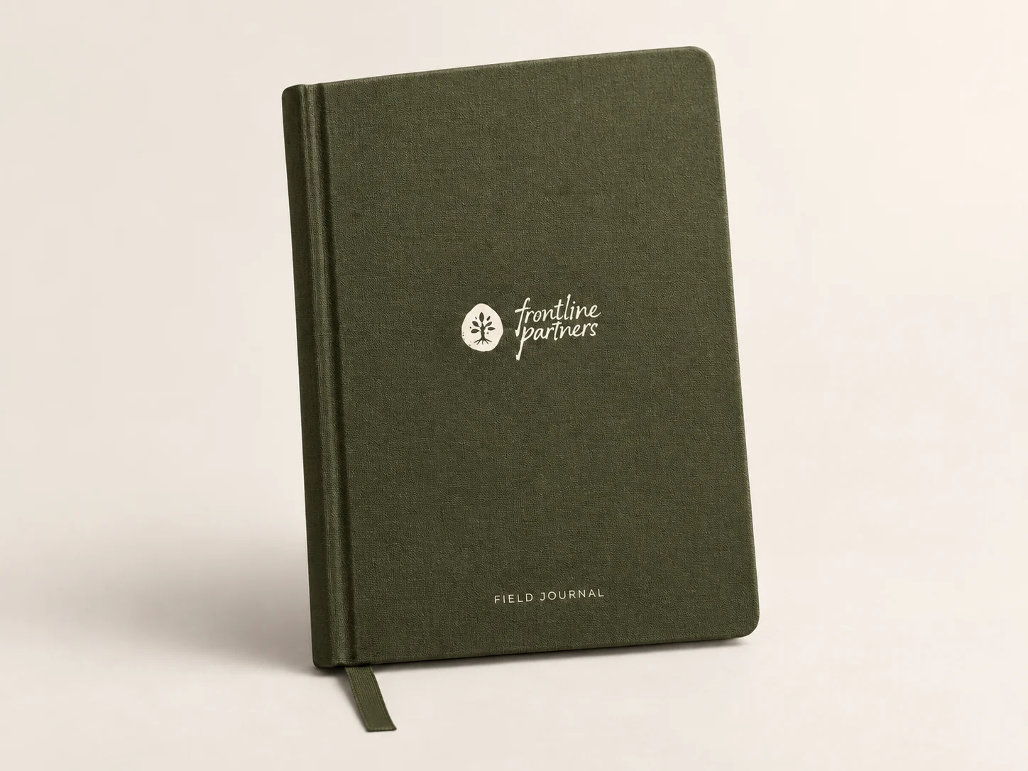
    Frontline Partners field journal in olive with its family-tree identity

    Next Case Study

    Frontline Partners

    Making Giving Feel Like Family

    Explore the case study

    Start a conversation

    Start with what you know.
    We’ll help shape the rest.

    Book an intro call

    Making Giving Feel Like Family

    We created a warm identity and a modular journal system to turn a global giving program into a more personal connection across distance.

    Frontline Partners landscape
    Project scope

    Brand Identity · Logo Development · Brand Starter Guidelines · Pitch + Presentation Decks · Editorial Identity · The Frontline Journal Master Template · Modular Layout System · Template Guidelines

    The First Conversation

    The Vision

    “We want the people who stand with the persecuted church to feel like family. Can you help us give that feeling an identity and a journal they’ll want to keep?”

    The Approach

    Made to feel human.

    We started with what Frontline Partners refused to be: one more donate button.

    Online giving has taught people to expect the look of a bank. It’s clean, efficient, and forgettable, with generosity reduced to a confirmation number. The alternative is often the opposite extreme, heavy with urgency and light on dignity. Sterile or sensational, rarely human.

    So we reached for the tactile over the techy: textures you could almost touch, marks that look made by hand, and a brand that feels less like a platform and more like a letter from someone you love.

    What We Delivered

    A mark with meaning.

    Frontline Partners now looks like what it is — a family, not a fund.

    The identity began with the logo. We explored how a mark could carry warmth, witness, and the feeling of something passed hand to hand. The family-tree-inspired stamp held family, lineage, connection, and permanence in one mark. Paired with the literary wordmark and grounded color system, it gave the team an identity that feels personal without becoming institutional, with starter guidelines to carry it from day one.

    The Color System

    Deep olive
    Warm brown
    Paper
    Olive
    Worn gold
    Sage
    Ink
    Parchment

    The Outcome

    A journal built for connection.

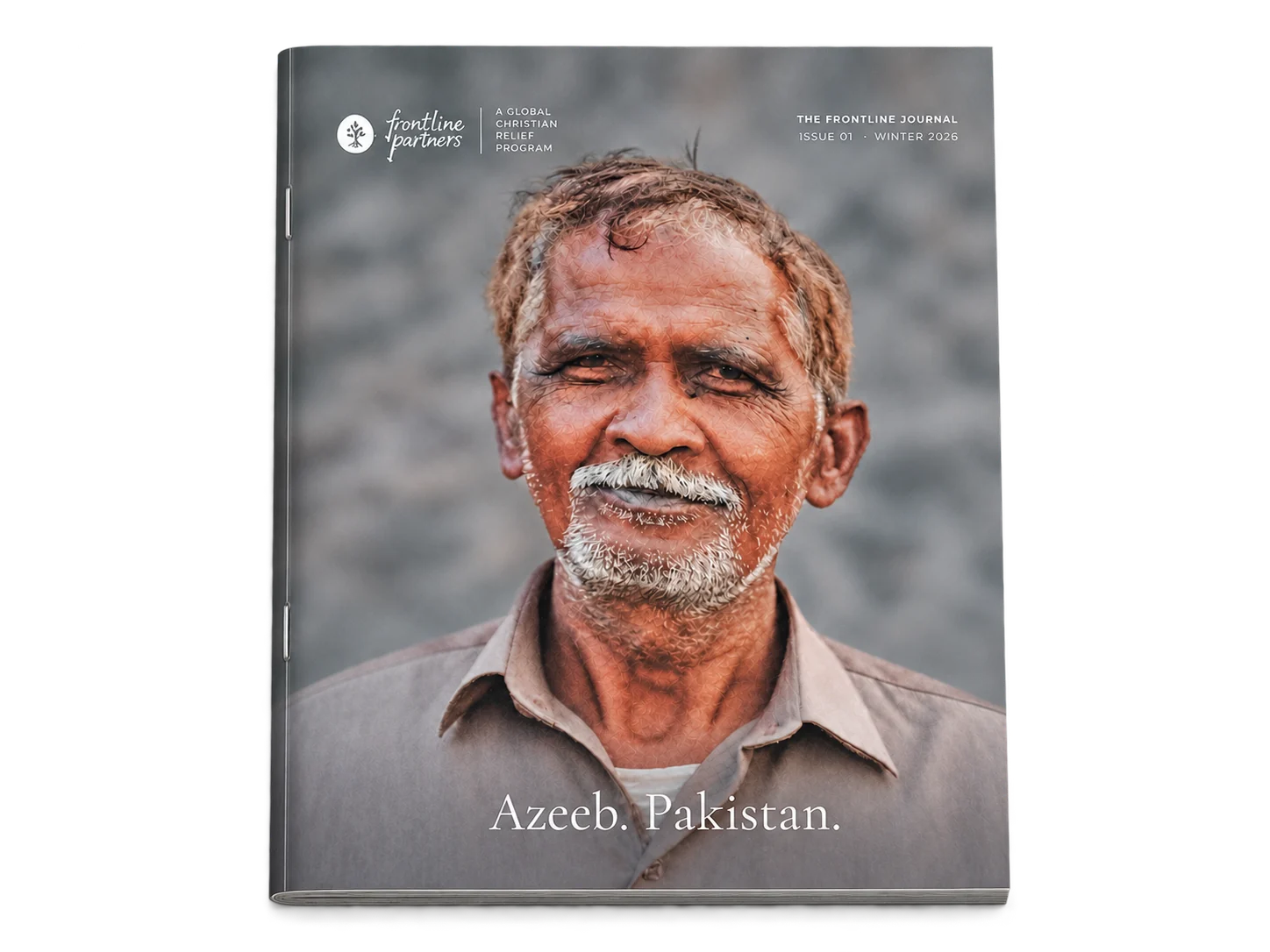
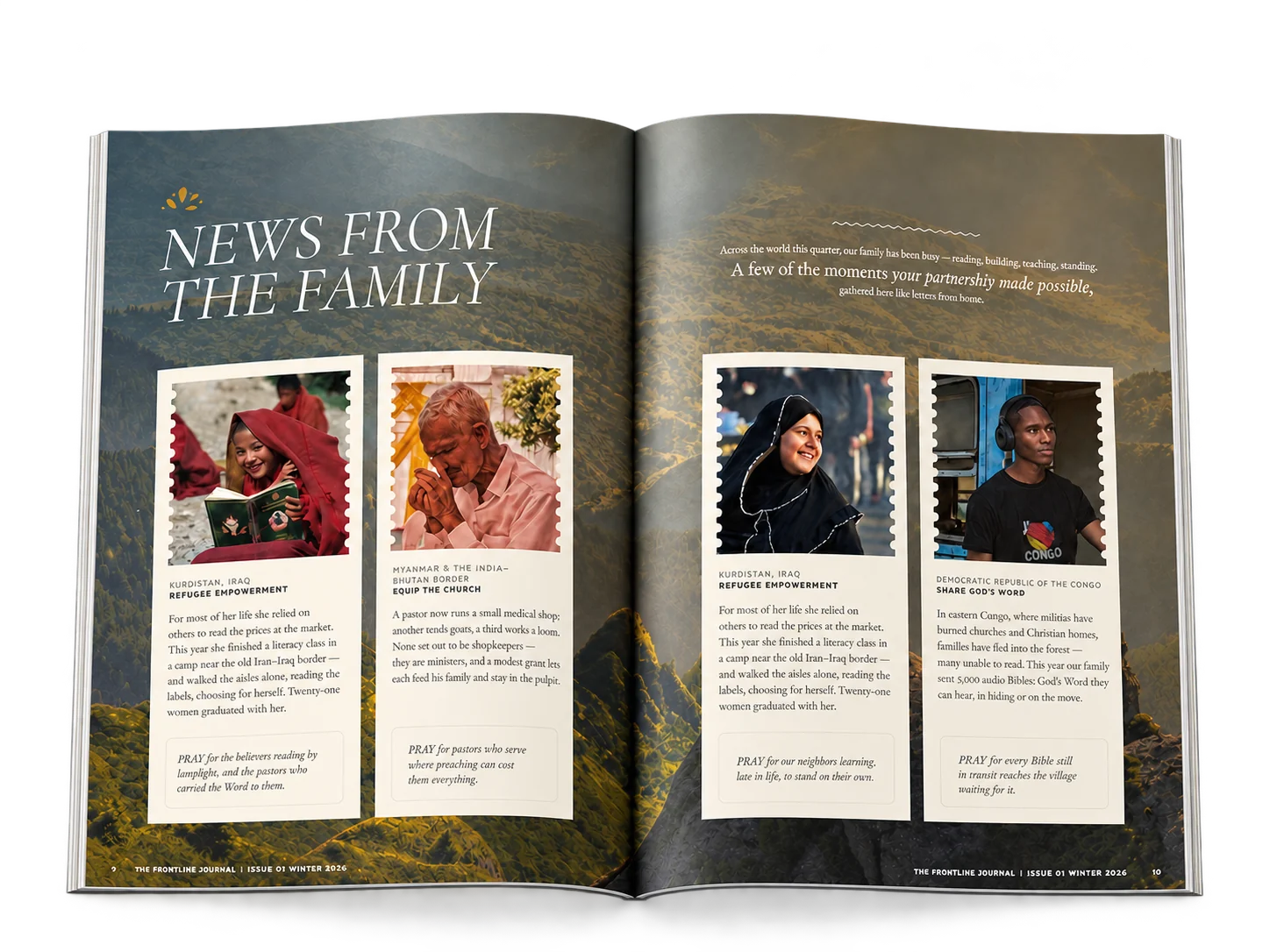
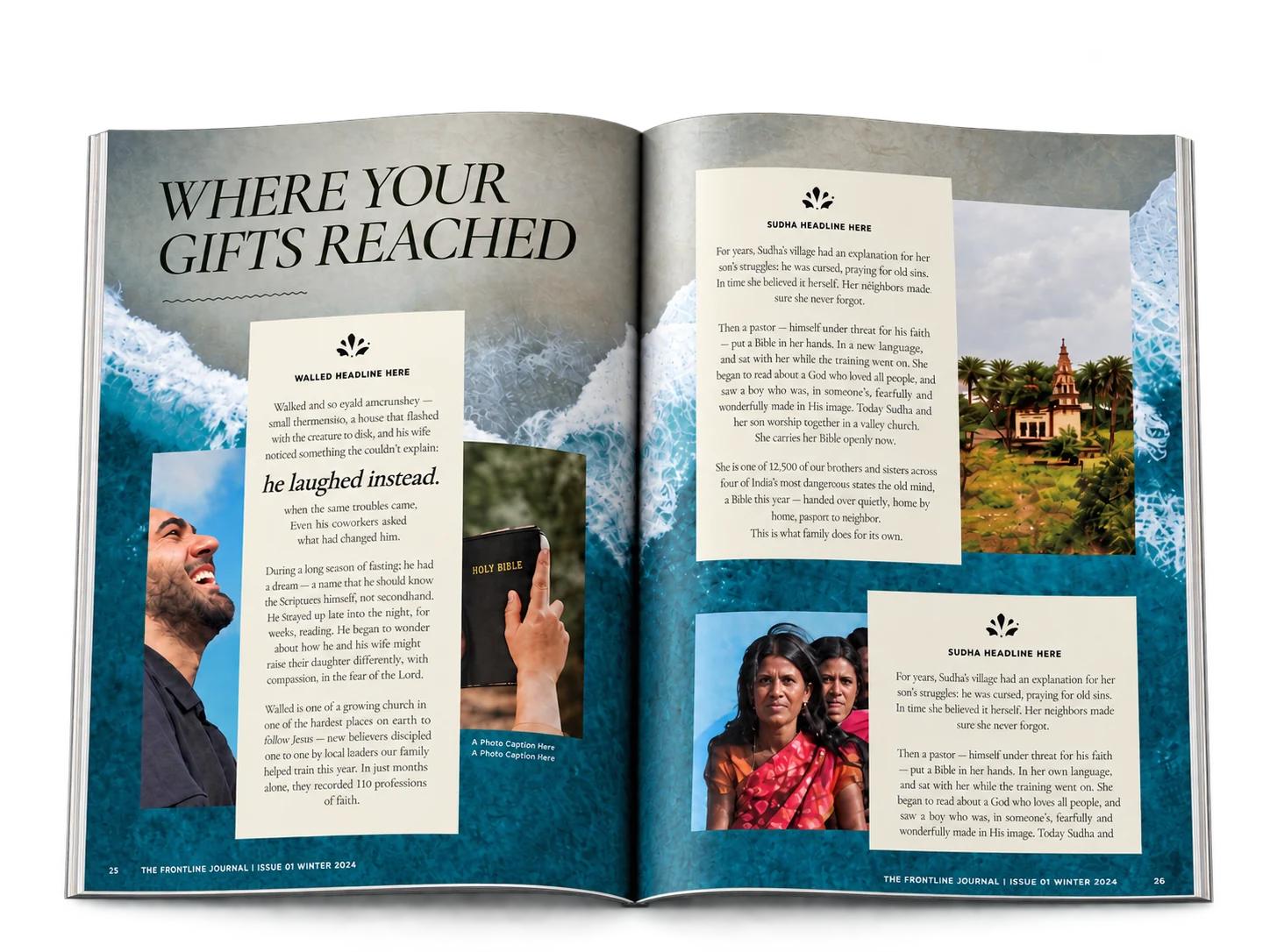
    Then we gave that identity a place to tell its stories. The Frontline Journal is a quarterly publication built entirely on the brand we’d made. Cormorant Garamond gives headlines their gravity. Crimson Text holds the testimonies and the prayers, the words meant to be read slowly. A handwritten face appears only when a human voice needs to break through the page. The cover gives GCR and Frontline Partners each their rightful place.

    And we made it theirs to keep. Beneath every spread sits a modular system of parent pages, so the team can choose a layout rather than design one. A visual layout menu shows every option at a glance. A guidelines document walks through building a new issue, step by step. We delivered it clean and imageless, a frame waiting for the next story, with one extra cover they didn’t ask for, because someday they’ll need it.

    It’s a brand that reminds every supporter they aren’t just sending something. They’re part of someone’s family.

    Some photography featured in this case study is courtesy of Global Christian Relief, and some imagery is sourced from unsplash.com. All imagery is shown here for portfolio presentation only.

    In Their Words

    “Vera team were amazing to work with. New product line logo and magazine, both projects were done with a high, unique design level of expertise. Highly recommend Vera Creative Partners for all your creative needs.”
    Frontline Partners, a program of Global Christian Relief
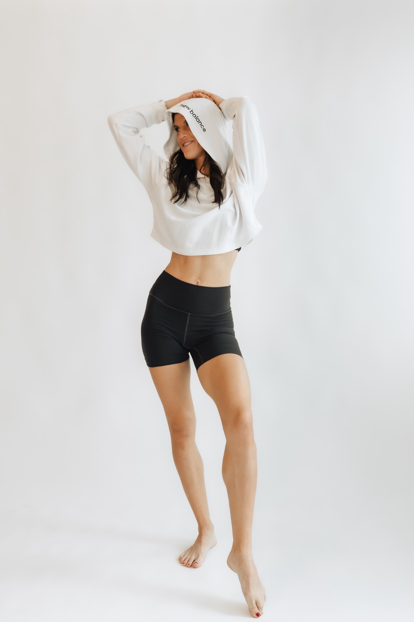
    Woman wearing black supportwear and a white cropped sweatshirt

    Next Case Study

    Embodie

    Making Postpartum Support Feel as Coveted as Fashion

    Explore the case study

    Start a conversation

    Start with what you know.
    We’ll help shape the rest.

    Book an intro call